Living Room Wall Paint Color Ideas That Transform Your Space
Staring at paint swatches is basically a guarantee that you’ll end up more confused than when you started. All those tiny chips look totally different once they’re on your walls, and suddenly that perfect gray you chose is either way too purple or weirdly green. The living room is the hardest to get right because it’s where you spend the most time—get the color wrong and you’ll see that mistake every single day.
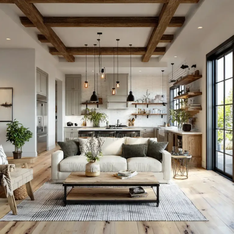
Living room wall paint color ideas consider how you actually use the space, your natural light situation, and what mood you’re trying to create. The right color choice enhances furniture, complements your style, and makes the room feel exactly how you want it to feel. It’s choosing strategically based on your specific conditions instead of just picking what looks pretty on a paint chip.
We’re covering 8 living room wall paint color ideas that work across different styles and light conditions. These aren’t trendy colors that’ll feel dated next year—they’re timeless choices that adapt to changing furniture and decor. And honestly? Understanding why these colors work helps way more than just seeing a list of paint names.
What Makes Living Room Wall Paint Colors Work
- Natural Light Determines Everything: The direction your windows face dramatically affects how colors appear—north light is cool and blue, south light is warm and golden. It’s working with your actual light instead of showroom conditions. The light awareness prevents colors looking completely different than expected.
- Room Size Affects Color Impact: Large living rooms handle bold dark colors beautifully while smaller spaces benefit from lighter reflective tones. It’s scaling color intensity to room dimensions. The proportional approach ensures colors enhance rather than overwhelm.
- Desired Mood Guides Selection: Calming spaces need different colors than energizing ones—blues and greens soothe while warmer tones activate. It’s intentionally creating atmosphere through color psychology. The mood-based choice ensures your living room feels how you want it to feel.
- Existing Elements Must Coordinate: Flooring, furniture, and fixed elements like fireplaces influence which colors work—choose shades that complement what’s staying. It’s designing around realities instead of starting from scratch. The coordinated approach creates cohesion.
8 Living Room Wall Paint Color Ideas
Transform your main living space with these living room wall paint color ideas that create atmosphere while working with your specific conditions.
Warm Greige for Versatile Neutrality
Paint walls in warm greige—the gray-beige hybrid that works with everything. The sophisticated neutral provides contemporary backdrop without coldness. It’s the modern neutral that replaced beige but kept the warmth.
Choose greige with warm undertones like Sherwin Williams Agreeable Gray or Benjamin Moore Revere Pewter. Test in your light ensuring it doesn’t read too gray or too beige. This living room wall paint color idea creates flexible foundations working with any furniture style or accent color.
Soft Sage Green for Calming Nature
Use muted sage green bringing organic calm inside. The nature-inspired color reduces stress while remaining sophisticated. It’s color that soothes without being bold or overwhelming.
Choose sage with gray undertones avoiding bright or yellow-greens. Pair with natural wood tones and cream accents. This living room wall paint color idea creates peaceful retreats perfect for relaxation and conversation.
Classic Gray for Modern Sophistication
Paint in true gray—not purple-gray or blue-gray—providing clean contemporary backdrop. The neutral shade lets furniture and art take center stage. It’s sophisticated simplicity that never goes out of style.
Try Benjamin Moore Gray Owl or Sherwin Williams Repose Gray testing extensively since grays shift dramatically in different lights. This living room wall paint color idea delivers timeless elegance working with modern and traditional furnishings.
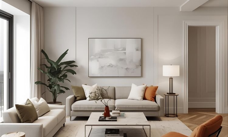
Warm White for Bright Openness
Choose creamy white with warm undertones creating bright airy spaces without stark coldness. The soft white reflects maximum light while feeling inviting. It’s brightness that’s comfortable not clinical.
Use Sherwin Williams Alabaster or Benjamin Moore White Dove avoiding pure whites that feel institutional. This living room wall paint color idea maximizes natural light creating fresh clean backdrops for any decor style.
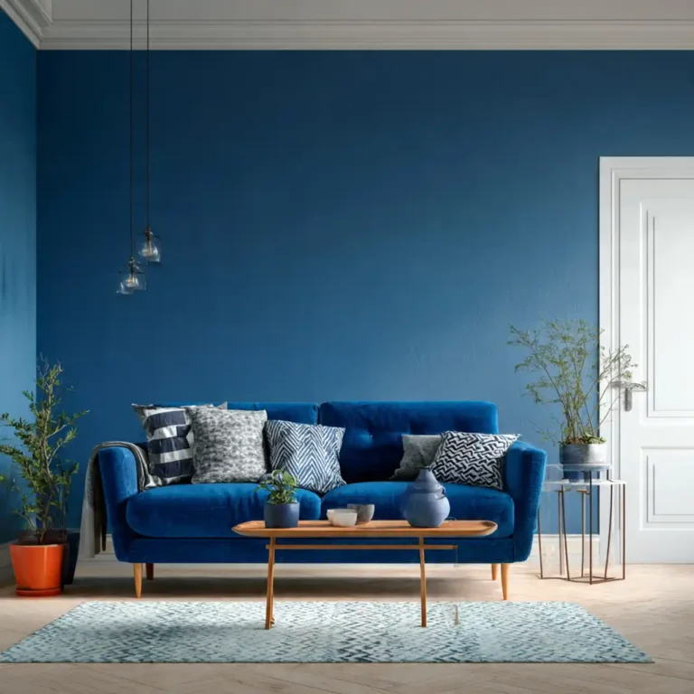
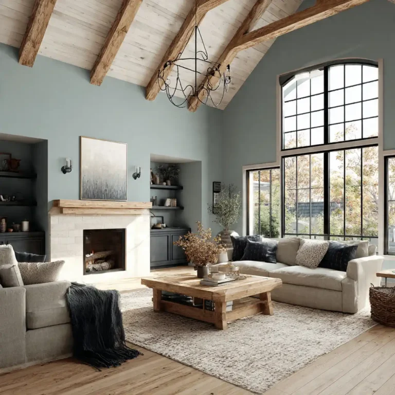
Navy Blue for Dramatic Depth
Paint walls in deep navy creating sophisticated drama and making the room feel wrapped and intentional. The bold choice works surprisingly well creating cozy atmosphere. It’s embracing color with confidence for memorable impact.
Ensure adequate lighting preventing the space from feeling too dark. Use warm metallics and light furniture balancing the depth. This living room wall paint color idea creates statement rooms with serious personality and warmth.
Soft Taupe for Warm Neutrality
Use warm taupe providing earthy neutrality that feels grounded and comfortable. The brownish-gray creates warmth without being as yellow as traditional beige. It’s updating beige for contemporary sensibilities.
Choose taupe with warm undertones complementing wood tones and natural materials. This living room wall paint color idea creates cozy welcoming spaces that never feel cold or sterile.
Pale Blue for Serene Calm
Paint in soft blue creating peaceful atmosphere and making spaces feel more open. The cool color psychologically lowers heart rate and reduces stress. It’s using color science creating genuinely calming spaces.
Choose blues with slight gray undertones avoiding baby blue or too-bright shades. Works especially well in south-facing rooms with warm natural light. This living room wall paint color idea creates tranquil spaces perfect for unwinding.
Charcoal for Bold Sophistication
Use deep charcoal creating moody dramatic atmosphere in larger living rooms. The dark walls make spaces feel intimate and designed. It’s bold color choice that requires commitment but delivers serious impact.
Balance with light furniture, good lighting, and metallic or bright accents. Works best in rooms with abundant natural light. This living room wall paint color idea creates gallery-like spaces showcasing art and furniture dramatically.
Making Living Room Wall Paint Colors Work
- Sample on Multiple Walls: Paint large swatches on different walls noting how light affects each one throughout the day. It’s seeing color in actual conditions from all angles. The comprehensive testing reveals how paint actually looks in your space.
- Consider Furniture Placement: Test colors on walls where major furniture will sit seeing how upholstery and wood tones interact. It’s ensuring colors complement what’s staying. The furniture-aware approach prevents clashing discoveries after painting.
- Live With Samples for Days: View colors morning, afternoon, evening, and night in both natural and artificial light. It’s understanding how colors shift throughout day. The patient observation prevents regret from hasty decisions.
- Factor in Adjacent Rooms: Consider how living room color flows to connecting spaces avoiding jarring transitions. It’s thinking about your home holistically. The connected approach creates better overall flow.
Frequently Asked Questions About Living Room Wall Paint Colors
What’s the Most Popular Living Room Color?
Warm grays and greiges dominate currently providing contemporary neutrality. Whites and soft blues remain classics. The most popular isn’t necessarily best for your specific room—choose based on your conditions not trends.
Timeless neutrals outlast trendy colors allowing easier furniture and decor changes. The classic choices provide flexibility while bold colors make stronger statements requiring more commitment.
Should Living Rooms Be Light or Dark?
It depends on room size, natural light, and desired mood. Larger rooms with good light handle dark colors creating drama. Smaller rooms or those with limited light benefit from lighter reflective colors maximizing brightness.
Consider how you use the space—relaxing rooms suit calmer colors while entertaining spaces handle bolder choices. The use-based decision ensures colors support actual function.
What Colors Make Living Rooms Feel Bigger?
Light colors with cool undertones—soft blues, light grays, pale greens—reflect light and recede visually. Painting ceiling and walls the same color eliminates boundaries expanding perceived space. The monochromatic approach maximizes spaciousness.
Avoid very dark or very warm colors in small living rooms as these advance visually making spaces feel smaller. The cool light palette creates airiness.
How Do You Choose Between Warm and Cool?
Consider your natural light—cool north light benefits from warm paint colors while warm south light handles cool colors well. Also consider desired mood—warm colors energize while cool colors calm.
Your existing furniture matters too—wood tones and warm fabrics pair with warm walls while modern furniture suits cooler tones. The balanced approach coordinates all elements.
Should You Paint an Accent Wall?
Accent walls work when you want color without full commitment or to highlight architectural features like fireplaces. Paint the wall you want to emphasize—usually the one behind the sofa or TV.
In small living rooms, accent walls can make spaces feel choppy. Larger rooms handle accent walls better. The scaled approach prevents visual fragmentation.
What About Open Concept Spaces?
Open living spaces benefit from consistent color throughout or very subtle shifts between zones. The continuous color creates flow and makes spaces feel larger. Dramatic color changes in open concepts feel disjointed.
You might use the same color family in different rooms—lighter in one area, slightly deeper in another. The related palette maintains unity while defining zones.
How Often Should You Repaint?
Living rooms need repainting every 5-10 years depending on wear, fading, and style changes. High-traffic living rooms show wear faster requiring more frequent updates. Quality paint lasts longer than cheap alternatives.
Color fatigue happens—if you’re tired of your color after a few years, it’s fine to change. The refresh updates your space without requiring major renovations.
Can You Test Colors Digitally?
Paint brand apps and visualizers help narrow choices but don’t replace actual samples. Digital screens display colors differently than paint on walls. Use apps for initial exploration then test real paint samples.
Lighting in your room dramatically affects appearance—no app replicates your specific conditions. The physical testing remains essential for accurate decisions.
Finding Your Perfect Living Room Color
Living room wall paint color ideas prove that choosing the right paint involves more than picking pretty colors from swatches. The strategic consideration of natural light conditions, room size, desired atmosphere, and existing elements creates living rooms that genuinely feel better while reflecting your personal style.
Start by honestly assessing your room’s conditions—light direction, size, fixed elements—choosing colors that work with these realities. Test extensively living with samples through different times and lighting conditions. The thoughtful patient approach delivers living room colors you’ll love living with for years rather than regretting weeks after painting.
What’s driving your paint choice—updating tired colors or completely changing the room’s vibe? I’m curious what you’re hoping to achieve with your new living room color!