Craftsman-Style Home Exterior Colors That Feel Warm and Welcoming
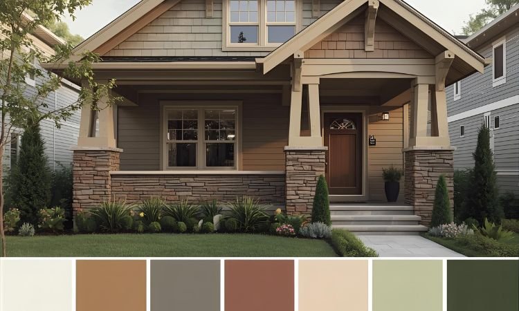
Drive through any historic neighborhood and you’ll spot Craftsman bungalows instantly—not just by their low-pitched roofs and wide porches, but by those perfectly chosen earth-tone paint schemes that make every detail pop. Most homeowners struggle choosing exterior colors, ending up with safe beige that washes out beautiful woodwork or trendy colors that fight the architecture completely.
Craftsman style homes exterior color choices should enhance rather than hide architectural details while honoring the Arts and Crafts movement’s connection to nature. The challenge is selecting combinations that feel authentic without looking like museum pieces.
We’re sharing 13 craftsman style homes exterior color ideas featuring time-tested palettes that bring out trim details, complement natural materials, and create genuine period character. You’ll discover which earth tones work best, how many colors to use, and where to apply each shade for maximum impact.
Essential Principles of Craftsman Exterior Colors
- Earth Tones Ground Design: Craftsman palettes draw from nature using colors found in soil, stone, and foliage rather than bright artificial hues. It’s like landscape painting where colors reflect natural surroundings. The organic palette creates harmony between home and setting.
- Multiple Colors Add Depth: Traditional schemes use three to five colors highlighting different architectural elements—body, trim, sash, accent details. It’s like layering where depth comes from varied tones. The multi-color approach showcases craftsmanship details defining the style.
- Contrast Reveals Details: Darker trim against lighter body or vice versa makes woodwork, brackets, and structural elements visible and appreciated. It’s like outlining where contrast brings features forward. The strategic emphasis celebrates rather than hides architectural character.
13 Craftsman Style Homes Exterior Color Ideas
Enhance your bungalow’s character with these craftsman style homes exterior color ideas featuring authentic period-appropriate palettes.
Sage Green Body with Cream Trim
Paint siding soft sage green paired with warm cream trim creating classic nature-inspired combination. The muted green recalls forest undergrowth while cream highlights architectural details.
Choose deeper olive or forest green for window sash and brackets adding depth. This craftsman style homes exterior color scheme delivers timeless appeal working across regions.
Warm Ochre with Brown Accents
Use golden ochre for main body suggesting autumn fields paired with rich chocolate brown trim. The warm palette creates inviting appearance while brown grounds and defines details.
Add burnt orange or rust for door or accent areas. This craftsman style homes exterior color combination captures harvest tones perfectly.
Taupe with Deep Red Trim
Apply warm taupe siding creating neutral sophisticated background for burgundy or deep red trim. The unexpected contrast adds drama while remaining period-appropriate.
Use darker taupe or charcoal for window sash. This craftsman style homes exterior color approach offers bold character within traditional boundaries.
Olive Green with Tan and Brown
Combine deep olive green body with tan trim and dark brown accents creating rich layered scheme.
The earthy trio suggests forest floor and tree bark establishing strong nature connection. This craftsman style homes exterior color palette works especially well with stone foundations and chimneys.
Russet Brown with Cream Details
Choose russet or terracotta brown for siding paired with creamy white trim highlighting brackets and beams.
The warm reddish-brown suggests clay and earth while cream makes woodwork pop. Add deeper brown for sash and doors. This craftsman style homes exterior color combination delivers warmth and visibility.
Cedar or Redwood Natural Stain
Preserve natural wood siding with quality stain protecting while showcasing grain and color. The honest material approach honors craftsman values celebrating wood’s inherent beauty.
Use cream or white trim creating contrast against natural tones. This craftsman style homes exterior color choice works beautifully with original wood siding.
Gray-Green with White and Black
Apply sophisticated gray-green creating subtle elegant backdrop for crisp white trim and black accents.
The cooler palette suits shaded properties or modern sensibilities while maintaining period appropriateness. This craftsman style homes exterior color scheme offers fresh take on traditional earth tones.
Mustard Yellow with Forest Green
Use deep mustard or gold body creating cheerful warmth paired with forest green trim. The complementary combination adds visual interest while remaining grounded in nature.
Include cream for secondary trim elements. This craftsman style homes exterior color pairing delivers personality and period charm.
Stone Gray with Bark Brown
Choose warm gray suggesting river stone combined with medium brown evoking tree bark. The neutral sophisticated scheme highlights architecture without overwhelming.
Add black or very dark brown for window frames. This craftsman style homes exterior color approach suits contemporary tastes within traditional framework.
Brick Red with Cream and Green
Apply brick red siding creating bold grounded statement softened by cream trim and sage green accents. The tri-color scheme adds complexity showcasing multiple architectural layers.
This craftsman style homes exterior color combination works particularly well with actual brick foundations or chimneys creating cohesive appearance.
Butter Cream with Olive and Rust
Use soft butter cream as lightest craftsman-appropriate body color paired with olive green trim and rust accents.
The lighter palette suits smaller homes or heavily shaded properties needing brightness. This craftsman style homes exterior color scheme maintains earth-tone integrity while adding luminosity.
Charcoal with Tan and Copper
Choose deep charcoal gray creating dramatic modern backdrop for warm tan trim. Add copper or bronze accents through paint or actual metal elements.
This craftsman style homes exterior color approach pushes boundaries while maintaining architectural respect.
Multi-Tone Brown Scheme
Layer various brown tones—medium body, darker trim, lighter accents—creating sophisticated monochromatic scheme. The subtle variations add depth without color complexity.
This craftsman style homes exterior color strategy delivers cohesive elegant appearance celebrating wood’s natural range.
Applying Craftsman Colors Successfully
- Body Color Covers Majority: Main siding color dominates visual impression so choose carefully considering sun exposure and surrounding landscape. It’s like canvas where background supports everything else. The primary selection sets overall tone and mood.
- Trim Color Highlights Details: Use contrasting trim color on fascia, corner boards, window casings, and columns making architectural elements visible. It’s like picture frames where trim defines and emphasizes. The strategic contrast showcases craftsmanship details defining style.
- Window Sash Adds Depth: Paint window frames and muntins in third color—often darkest shade—creating additional layer and emphasizing opening patterns. It’s like eyeliner where dark frames make features pop. The extra effort adds sophisticated finish.
- Test Before Committing: Paint large sample boards and view at different times of day and weather conditions before deciding. It’s like dress rehearsal where testing prevents expensive mistakes. The preview ensures satisfaction with final results.
Frequently Asked Questions About Craftsman Exterior Colors
What Colors Are Most Authentic for Craftsman Homes?
Traditional craftsman palettes include sage green, ochre, olive, warm browns, taupes, and russets—all earth tones derived from nature. These colors honored Arts and Crafts philosophy celebrating natural materials and organic beauty. Avoid pastels, bright primary colors, or stark white unsuited to period character.
Historical paint analysis on preserved craftsman homes confirms earth-tone dominance. While individual preferences varied, natural color families remained consistent across regions and builders maintaining stylistic coherence.
How Many Colors Should You Use?
Traditional craftsman schemes use three to five colors applied strategically across different architectural elements. Typical breakdown includes body color, primary trim, secondary trim or sash, accent color, and sometimes foundation tone. The layered approach adds depth while showcasing detailed woodwork.
More colors allow greater architectural emphasis but require careful coordination preventing chaos. Fewer colors create simpler schemes risking flatness without sufficient contrast revealing details.
Should Trim Be Lighter or Darker Than Body?
Either approach works depending on desired effect and specific colors chosen. Lighter trim against medium body creates traditional appearance common on original bungalows. Darker trim against lighter body adds drama and contemporary edge while remaining period-appropriate.
Consider existing elements like stone foundations or brick chimneys when deciding. The trim choice should create clear definition making architectural details visible and appreciated rather than hidden.
Can You Use Modern Colors on Craftsman Homes?
Contemporary earth tones work beautifully maintaining craftsman spirit while reflecting current tastes. Sophisticated grays, deeper charcoals, and richer browns offer fresh takes on traditional palette. Avoid trendy brights, pastels, or colors completely disconnected from nature contradicting fundamental style principles.
The goal is honoring Arts and Crafts values—natural materials, honest construction, nature connection—through color choices supporting rather than fighting architectural character.
How Do You Choose Colors for Specific Settings?
Consider surrounding landscape, neighboring homes, and natural light conditions. Homes under heavy tree cover benefit from warmer lighter colors preventing dark cave-like appearance. Open sunny locations handle deeper richer tones without overwhelming. Respect neighborhood context while expressing individual character within appropriate boundaries.
Test samples on actual exterior viewing throughout day as light changes dramatically affecting color perception. The environmental approach ensures colors working specifically for your home’s unique situation.
Bringing Out Your Bungalow’s Best
These craftsman style homes exterior color ideas prove that authentic period palettes enhance rather than hide architectural character. The nature-inspired combinations honor Arts and Crafts values while creating beautiful inviting exteriors that improve neighborhoods. The strategic approach showcases craftsmanship details making craftsman homes beloved.
Start with earth-tone body color appropriate to your setting and architectural scale. Add contrasting trim highlighting woodwork and structural elements. Layer additional colors on sash, doors, or accent features creating depth. The thoughtful combinations bring out your bungalow’s best features while maintaining timeless appeal that weathers trends beautifully.
Which color combination speaks to your craftsman home? Share your exterior color choices or painting challenges below!